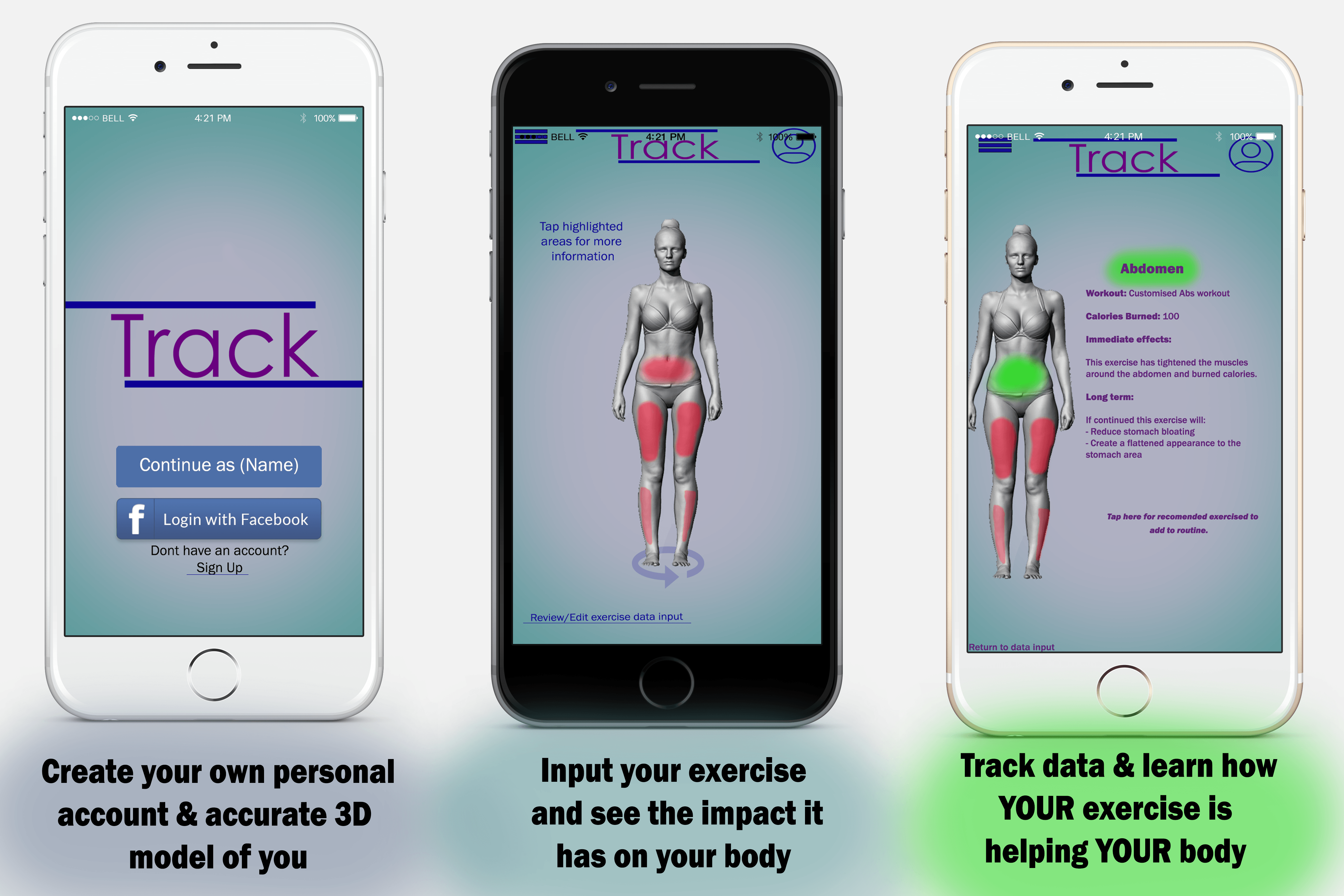
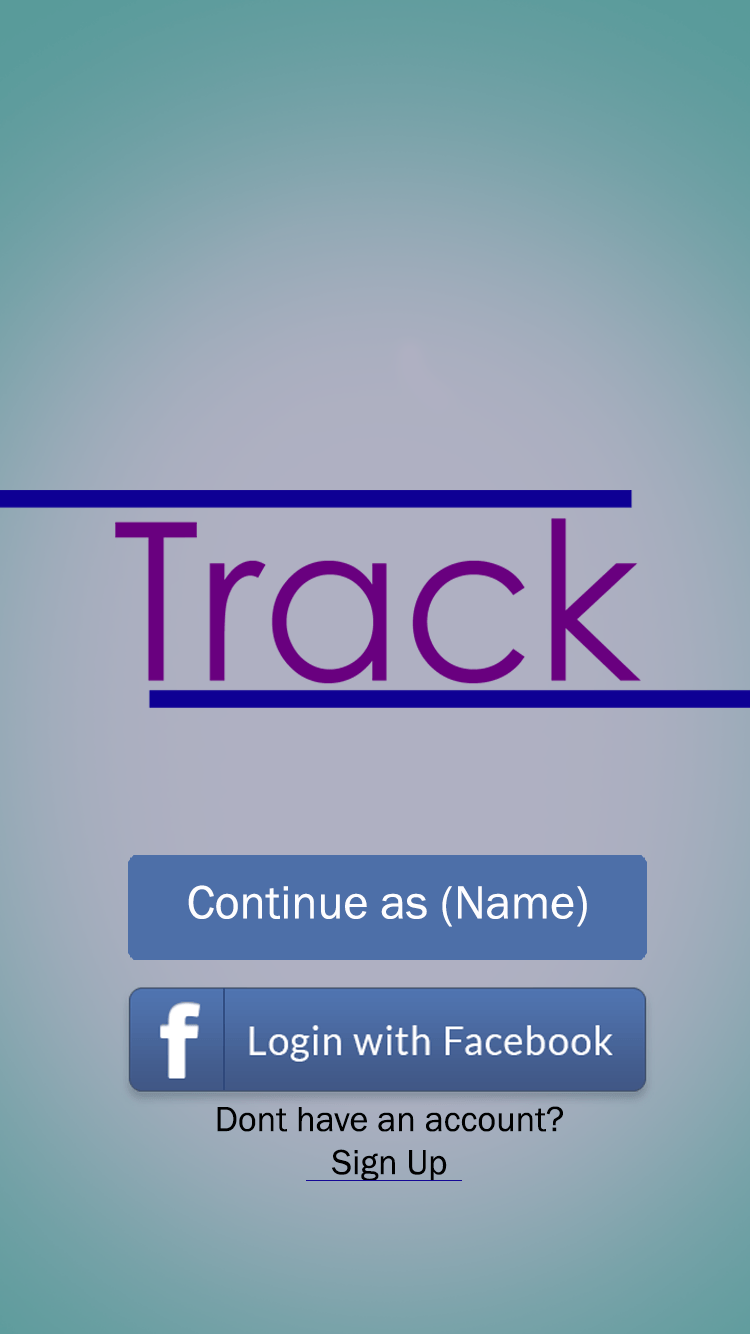
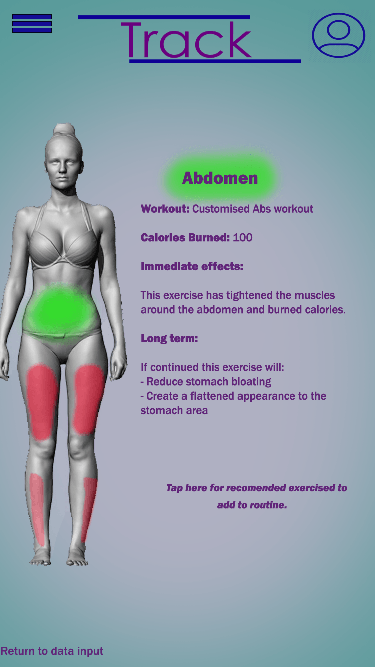
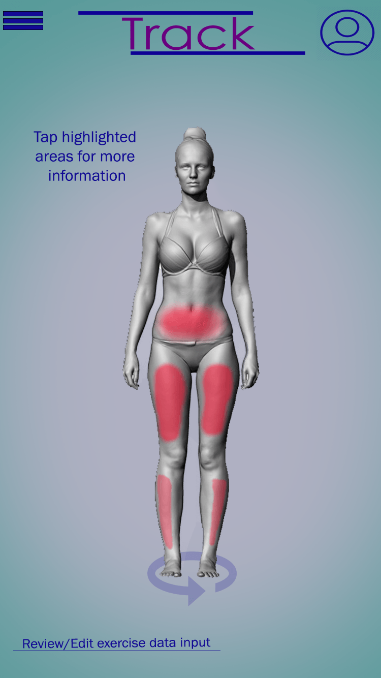
Crowdfunding Research
As part of this project I am to produce a mock up crowd funding page in order to advertise my idea. To help me with this, I have researched into a variety of different crowdfunding websites such as ‘Indigogo’, ‘KickStarter’ and ‘Go Fund Me’. From this research I have compiled a list of key components used within successful pages:
- A brief summary
- Photos/screen shots/ a video
- Why the idea should be backed – the impact its going to have
- Pledge & Often some sort of incentive to encourage people to donate
- What the money will go towards
- Risks and challenges
1. KickStarter -GoGym: Fitness Exercises & Workouts App
URL: https://www.kickstarter.com/projects/831618462/go-gym-fitness-exercises-and-workouts-app?ref=most_backed&ref=discovery&term=exercise%20app
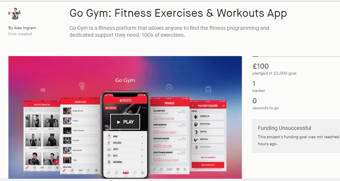
The first crowdfunding page I looked into was ‘Go Gym’ – this app links to my overall research as the app is within the lifestyle section – focusing specifically on my chosen topic of exercise. The app allows users to find a workout that appeals to their needs and recommends a variety of exercises.
I think this example has some successful traits – the photos are clear and visually pleasing, and there is a lot of detail about what aspects the funding supports. However, I don’t think this example gives enough information about the contents of the app, there is a large bulk of information regarding the creator and his background – as opposed to detail about the app.
2. Fantastic Fitness
URL: https://www.kickstarter.com/projects/1132866489/fantastic-fitness?ref=discovery&term=mobile%20apps
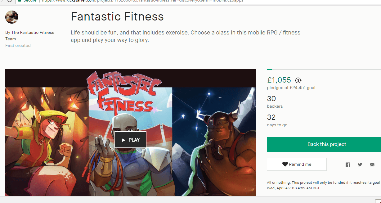
Fantastic Fitness is an app that aims to motivate users to do more exercise – it does this in the innovative form of a game, by doing more exercise users unlock more content and level up. The link to fitness as well as being an app is what made this kickstarter appeal to me.
There are some great features to this kickstarter – there is a clear discussing regarding what the app is and how doing exercise corresponds within the actual game. There is also a really useful pie-chart breakdown showing what contributors money will go towards, this is effective as it is a bright visual way of showing the information as opposed to a paragraph/list which people may not fully engage in reading.
I personally believe this is a very successful crowdfunding page, the only improvement would be a clearer breakdown of the app and its specific features – it gives paragraphs showing what exercise results in, but it does not give an a simplistic breakdown of the functionality of the app, which some people may be interested in.
3. Make 100..birds you will never see again
URL: https://www.kickstarter.com/projects/730497413/make-100-birds-you-will-never-see-again?ref=discovery
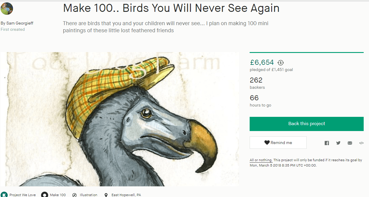
I decided to look at this kickstarter page purely from the perspective of it being incredibly successful – I wanted to look at how it has achieved such an overwhelming positive response. Although irrelevant to my own project – this kickstarter is an individual who is offering to hand-paint cartoon-esque images of extinct birds to everyone who donates, his initiative being that they will allow future generations to be taught about these different birds.
This crowdfunder seems to be so successful because of how simplistic and visual it is – it contains numerous bright and colourful examples of drawings and very little text. The creator explains that they just want to spread knowledge in a fun way that can be passed on through generations, then roughly 80% of the page is just example paintings.
As mentioned, this kickstarter is simple but effective. Perhaps the individual could give more insight regarding what the money goes towards, but otherwise I would argue that it does not need improving.
Conclusion:
Overall what I have learnt from research is that the most successful campaigns are the one’s that take a visual approach to give information out – they use videos, pictures and pie charts. Therefore I want to try and incorporate this effectively into my own response, whilst also finding a balance of using text to get other parts of information across. The overall outcome needs to be engaging but informative.
What I will do next: I am currently working on developing my R&D file, concept visualisation and spark page. I plan to post screenshots of the outcomes within blog posts.