Branding
Logo
The name ‘Track’ simply represents the main function of the app – the ability to track exercise. I decided to form a logo that is quite simplistic with just the title with two horizontal lines above and below – these represent a running track to connote exercise such as running, I also thought they added more to the logo as opposed to it simply just being text with nothing surrounding it. I also decided to use blue and purple as in regards to colour theory they are analogous colours and are therefore engaging and aesthetically pleasing, which i believe will make it more appealing to my audience. 
Icon
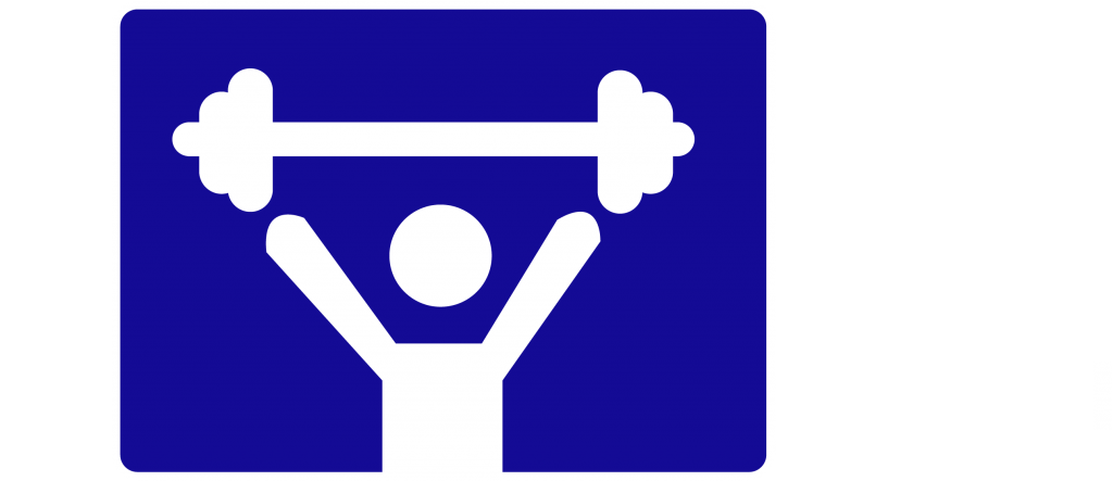
For my icon I again decided to keep it quite simple in design. Using Adobe InDesign I created a blue background using the same colour used in the logo and then created a figure holding some weights and filled it in white. This simplistic style was inspired by iconic social media apps such as Facebook and Twitter – “A simple logo design allows for easy recognition and allows the logo to be versatile” (Cass, J. 2009) I drew inspiration from this and created a bold but simplistic design that would stand out on the home page of a mobile.

