
Influences Research
This part of my secondary research is dedicated to looking at a variety of sources and platforms that may influence my final product in regards to functionality, aesthetics, layout and emotional attributes.
1. Instagram
App: Instagram
URL: https://www.apple.com/us/search/instagram?src=globalnav

Context: Instagram is a social media site used primarily to upload pictures; people can then interact with one another through liking and commenting on one another’s photos – and can also direct message each other. The instagram app is layed out into 5 main segments: the ‘home screen’, the explore page, the upload page, a notifications area and a personal profile. The layout is simplistic and straight to the point, allowing easy and fluid use of the app.
The reason I have decided to include Instagram within my research is due to its layout and functionality as an application.
Positive Learning:
- Simplistic colour scheme: off-white coloured background, bold gradient-colour framing around subjects; the framing links to its branding and logo design.
- Simplistic navigation system – use of icons makes it very easy to navigate the app and instantly know what each button does
- Very visual app; lack of writing makes it more appealing and engaging
As a whole, the Instagram app is a subject that I believe will highly influence me; the app is very simplistic in design and its use of icons makes it look vastly more appealing – I hope to incorporate this into my design as I think it will be far more engaging for my target audience. I also really like the use of an off-white background alongside a bold framing around specific area’s as I think this is an effective way of highlighting important information – it immediatly alerts a viewer due to the contrast.
Negative Learning:
- Notifications area is very clustered with information and can be confusing – no set structure
- Profile area could possibly be more personal in regards to information input
As mentioned, the Instagram app layout is very fluid and concise throughout – however, I do believe it has some flaws. The notifications area is very clustered and it is often hard to see who has liked your photo and what they have commented as all the notifications are addressed in one long list which is very unattractive to the viewers eye. Within my own design, should i chose to include a notifications area, I would want to do it in a very clear way that allows the audience to distinguish what notifications they have already read, which ones are unread and what individual interactions have taken place. As mentioned, the profile area also feels like a slight negative as it isn’t very personal: all that can be written is your name and a short bio. In my own design I would want the user to make it feel slightly more personal: obviously due to it being targeted at health this information would probably include weight and height etc. I think this would allow the app to feel more immersive and personal.
2. Human Anatomy Atlas – 3D Anatomical Model of the Human Body
App: Human Anatomy Atlas – 3D Anatomical Model of the Human Body

Context: This app allows users to rotate, pan and zoom in/out of 3D models of the human body. Mainly used by students and people training within the field, the app allows a complex view of the whole body structure from the skeleton right down to the finer details of veins. The app allows the user to look at every part of the body and gives an insight to the subject matter they are looking at e.g. its name and function.
This app interests me as I want to take an application-based approach whereby users can track and monitor the effects of their activity; and one idea of mine was to do this through the use of a 3D model. By looking at this app I hope to measure the success of using such a model.
Positive learning:
- Very in-depth with regards to information
- Gender neutral
- Able to access information layer by layer of the body e.g. skin, bones, nervous systems etc.
- Very easy and simplistic to navigate – zoom, tap and scroll
I really like the use of 3D models within this app, I think it allows a successful way to teach and engage an audience about the functions of the body as it is both highly interactive and informative. I really like that the app allows you to see the body by layers allowing it to be very specific in detail. I would like to use a 3D model in my own app to show users the effect that exercise is having on them, and therefore think it would be really useful to have this level of detail as it is going to show them both the noticeable and unnoticeable implications. I also really like the simplistic navigation, it is something well-known to mobile users and therefore will allow them to use the app without disruption.
Negative Learning:
In terms of the research I have done into this app (the functionality) I personally do not see many flaws. The only thing I would perhaps change within my own design is making written information slightly clearer and not as clustered – I want it to be simplistic and engaging to my audience – where this app gives a vast amount of icon options, I would much rather display clear and concise information that is going to instantly grab the users attention and keep them motivated and willing to engage.
3. Map My Fitness Workout Trainer
App: Map My Fitness Workout Trainer
URL: https://play.google.com/store/apps/details?id=com.mapmyfitness.android2
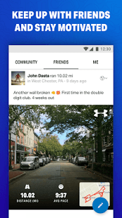
Context: ‘Map My Fitness Workput’ is an app on the lifestyle market – it allows users to track the locations and distances that they run/walk every day and stores this data in a graph system that the user can access and review. This app interests me in terms of research and development as I really like it’s simplistic use of community – users can add friends and look at what activity they have done that day and it gives them a sense of motivation.
Positive Learning:
As mentioned, the main reason I have took an interest in this app is its community function. I think despite not being able to directly interact with friends, it is motivational to be able to see what they have achieved that day and what routes they have taken. This use of incorporating a friends function into the app gives the user an incentive and reason to stay active – if they see the progress that their friend makes then they will feed off this positive energy.
I could potentially use what I have learned from this feature by using it within my own app – I could create a function whereby users can add their friends and see what exercise they have done that day, and if users choose to publicise statistics such as weight loss then this could also be data that friends could see. I think it will motivate users as it will create friendly competition and create motivation to impress one another and to participate within exercise.
Negative Learning:
As i was mainly looking into this app for one function, I have not taken in any negative learning as I think everything I have learned reflects positively on the app and will also help me with my own development.
What I will do next: This completes my secondary research, so my next step is to go back to primary research and review the responses on the questionnaires. I will then analyse and display this information within a blog post.